
【Rails】ViewComponentを使ってshadcn/uiのボタンコンポーネントを再現する
 2025/02/16
 2025/02/16
.png&w=640&q=75)
今回はUIコンポーネントライブラリであるshadcn/uiのボタンコンポーネントをRailsのViewComponentで再現してみます。
ViewComponentについてはこちらの記事でも解説しています。
shadcn/uiを使ってみる
shadcn/uiではカスタマイズ可能な様々なコンポーネントが準備されています。
今回参考にするbuttonコンポーネントを実際に使ってみます。
Nextjsの環境構築
動作確認用の環境としてNextjsのプロジェクトを作成します。Nodejsがインストールされている前提で進めていきます。
バージョンはv20.10.0を使用しています。
npx create-next-app@latest
※記事執筆時点ではNext.jsバージョン15.1.7でプロジェクトが作成されます。
プロジェクトの設定について質問されるので回答していきます。
今回はshadcn/uiを使ってみることのみが目的なので設定は適当で大丈夫ですが、一例を載せておきます。
質問 | 回答 |
|---|---|
What is your project named? | shadcnui-test(任意のプロジェクト名) |
Would you like to use TypeScript? | Yes(TypeScriptを使用) |
Would you like to use ESLint? | Yes(ESLintを使用) |
Would you like to use Tailwind CSS? | Yes(Tailwind CSSを使用) |
Would you like your code inside a | No(srcディレクトリを使用しない) |
Would you like to use App Router? (recommended) | Yes(App Routerを使用) |
Would you like to use Turbopack for | Yes(Turbo packを使用) |
Would you like to customize the import alias (`@/*` by default)? | No(import時のエイリアスをカスタマイズしない) |
プロジェクトディレクトリに移動してプロジェクト立ち上げ、ブラウザでの確認ができればNextjsの環境構築は完了です。
ディレクトリ移動
$ cd shadcnui-testプロジェクト立ち上げ
$ npm run devhttp://localhost:3000にアクセス
shadcn/uiインストール
shadcn/uiをインストールします。
今回は-dオプションを付けてデフォルトのスタイル設定でインストールします。
$ npx shadcn@latest init -dnpx shadcn@latest ~ を実行する際に以下のようなReactのバージョンによる依存関係の警告が出る場合があります。
今回は強制的に使用する(Use --force)を選択します。
It looks like you are using React 19.
Some packages may fail to install due to peer dependency issues in npm (see https://ui.shadcn.com/react-19).
? How would you like to proceed? › - Use arrow-keys. Return to submit.
buttonコンポーネント追加
インストールが完了したら以下を実行してbuttonコンポーネントを追加します。
$ npx shadcn@latest add buttoncomponents/ui配下にbutton.tsxが作成されます。
表示確認
作成されたコンポーネントを使ってみます。
app/page.tsxのreturnの内容を全て削除して以下のように修正します。
import { Button } from "@/components/ui/button";
export default function Home() {
return (
<div>
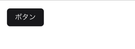
<Button>ボタン</Button>
</div>
);
}
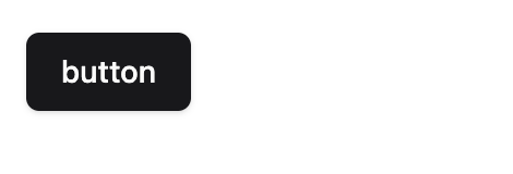
トップページにアクセスするとボタンのスタイルが適応されていることが確認できます。
buttonコンポーネントにはvariant, sizeという引数を渡すことができ、スタイルをカスタマイズできます。
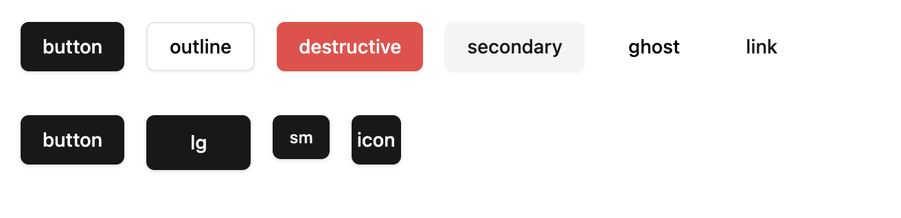
variantの例
コード
import { Button } from "@/components/ui/button";

export default function Home() {
  return (
    <div className="p-4 flex gap-4">
      <Button>default</Button>
      <Button variant="destructive">destructive</Button>
      <Button variant="outline">outline</Button>
      <Button variant="secondary">secondary</Button>
      <Button variant="ghost">ghost</Button>
      <Button variant="link">link</Button>
    </div>
  );
}
表示
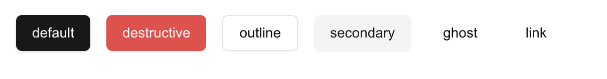
※ghost, linkはホバーした時のスタイルが異なります。
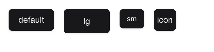
sizeの例
コード
import { Button } from "@/components/ui/button";

export default function Home() {
  return (
    <div className="p-4 flex gap-4">
      <Button>default</Button>
      <Button size="lg">lg</Button>
      <Button size="sm">sm</Button>
      <Button size="icon">icon</Button>
    </div>
  );
}
表示
また、ボタンを非活性にしたり、スタイルを追加することもできます。
import { Button } from "@/components/ui/button";

export default function Home() {
  return (
    <div className="p-4 flex gap-4">
      <Button disabled>disabled button</Button>
      <Button className="w-full">custom class button</Button>
    </div>
  );
}
表示

Rails・ViewComponentで再現
shadcn/uiのbuttonコンポーネントをRailsのViewComponentで再現していきます。
環境構築
バージョンは以下を使用しています。
$ rails -v
Rails 8.0.1

$ ruby -v
ruby 3.3.4
Railsのプロジェクトを作成します。
$ rails new button-component --javascript esbuild --css tailwindオプションとして以下を指定しています。
JavaScriptのビルドにESBuildを使用cssフレームワークのTailwind CSSを使用
ViewComponent追加
今回はディレクトリ階層のカスタマイズなどを行うため、view_component-contribというGemを使用します。
READMEに記載してある対話型のジェネレータを実行します。
$ rails app:template LOCATION="https://railsbytes.com/script/zJosO5"いくつか質問されるので回答していきます。
質問 | 回答(説明) |
|---|---|
Where do you want to store your view components? | app/views/components(コンポーネントファイルの保存先ディレクトリを指定) |
Would you like to use dry-initializer in your component classes? | y(dry-initializerを使用する) |
Do you use Stimulus? | y(Stimulusを使用する) |
Do you use TailwindCSS? | y(Tailwind CSSを使用する) |
Would you like to create a custom generator for your setup? | y(カスタムジェネレーターを使用する) |
Which template processor do you use? | 1(ERBを使用する) |
Style Variantsを追加
view_component-contribで準備されているStyle Variantsを使用できるようにしておきます。
class ApplicationViewComponent < ViewComponentContrib::Base
  extend Dry::Initializer

  include ViewComponentContrib::StyleVariants # 追加
end
Style Variantsを使うことで以下のようなスタイルの定義が可能になります。
style do
  base {
    %w[
     # 共通のスタイル
    ]
  }
  variants {
    variant {
      primary {
        %w[
          # 個別のスタイル
        ]
      }
      outline {
        %w[
          # 個別のスタイル
        ]
      }
    }
  }
end
Style VariantsはTailwind Variants, CVA variantsというライブラリから影響を受けているようです。
The idea is to define variants schema in the component class and use it to compile the resulting list of CSS classes. (Inspired by Tailwind Variants and CVA variants).
shadcn/uiでは同じ用途でCVA variantsを使用しています。(buttonコンポーネントにおける該当箇所)
buttonコンポーネント作成
表示確認
generateコマンドを実行してbuttonコンポーネントを生成します。
引数としてshadcn/uiと同じようにsize, variantを渡せるようにしておきます。
$ rails g view_component Button size variantクラス定義、ロジックの記述などを行うcomponent.rbとレンダリングを行うためのcomponent.html.erbファイルの他にテスト用のファイルやプレビュー用のファイルも生成されます。
生成するファイルの設定はgeneratorの設定ファイルから変更できます。
テスト用、プレビュー用のファイルを生成しない場合は以下のように修正します。
# frozen_string_literal: true

# Based on https://github.com/github/view_component/blob/master/lib/rails/generators/component/component_generator.rb
class ViewComponentGenerator < Rails::Generators::NamedBase
  source_root File.expand_path("templates", __dir__)

  class_option :skip_test, type: :boolean, default: true # テストファイルを生成しない
  class_option :skip_system_test, type: :boolean, default: true # システムテストファイルを生成しない
  class_option :skip_preview, type: :boolean, default: true # プレビューファイルを生成しない
# 省略
表示用のページを作成します。
コントローラー、viewファイル作成
$ rails g controller home indexルーティング
Rails.application.routes.draw do
  # Reveal health status on /up that returns 200 if the app boots with no exceptions, otherwise 500.
  # Can be used by load balancers and uptime monitors to verify that the app is live.
  get "up" => "rails/health#show", as: :rails_health_check

  # Render dynamic PWA files from app/views/pwa/* (remember to link manifest in application.html.erb)
  # get "manifest" => "rails/pwa#manifest", as: :pwa_manifest
  # get "service-worker" => "rails/pwa#service_worker", as: :pwa_service_worker

  # Defines the root path route ("/")
  root "home#index"
endbuttonコンポーネントのsize,variantのデフォルト値を定義しておきます。
# frozen_string_literal: true

class Button::Component < ApplicationViewComponent
  option :size, default: proc { :default}
  option :variant, default: proc { :default}
endデフォルトで記述されていたwith_collection_parameter :buttonは今回は使わないので削除しています。
こちらの記述もgeneratorファイルを編集することで生成しないよう設定ができます。
# frozen_string_literal: true

class <%= class_name %>::Component < <%= parent_class %>
  with_collection_parameter :<%= singular_name %> # 削除
<%- if initialize_signature -%>
  <%= initialize_signature %>
<%- end -%>
end
ルートページで表示してみます。
<%= render(Button::Component.new) %>component.html.erbの内容が表示されることが確認できます。
helperの定義
Button::Component.newのような記述を簡潔に書けるようにhelperを定義します。
module ApplicationHelper
  def component(name, *args, **kwargs, &block)
    component = (name.to_s.split("/").map(&:camelize).join("::") + "::Component").constantize
    render(component.new(*args, **kwargs), &block)
  end
end
これでコンポーネントの呼び出しが簡潔に書けるようになりました。
<%= component(:button) %>スタイルの定義
shadcn/uiのカラーを参考にスタイルを定義します。
@tailwind base;
@tailwind components;
@tailwind utilities;

/* 追加 */
:root {
  --background: 0 0% 100%;
  --foreground: 240 10% 3.9%;

  --border: 240 5.9% 90%;
  --input: 240 5.9% 90%;

  --primary: 240 5.9% 10%;
  --primary-foreground: 0 0% 98%;

  --secondary: 240 4.8% 95.9%;
  --secondary-foreground: 240 5.9% 10%;

  --accent: 240 4.8% 95.9%;
  --accent-foreground: 240 5.9% 10%;

  --destructive: 0 84.2% 60.2%;
  --destructive-foreground: 0 0% 98%;

  --ring: 240 5.9% 10%;
}
Tailwind CSSのクラスで使えるように定義、クラスファイル内で定義したTailwind CSSのクラスを適応できるようパスを追加します。
module.exports = {
  content: [
    './app/views/**/*.html.erb',
    './app/views/components/**/*.rb', // 追加
    './app/helpers/**/*.rb',
    './app/assets/stylesheets/**/*.css',
    './app/javascript/**/*.js'
  ],
  // 追加
  theme: {
    extend: {
      colors: {
        border: "hsl(var(--border))",
        input: "hsl(var(--input))",
        ring: "hsl(var(--ring))",
        background: "hsl(var(--background))",
        foreground: "hsl(var(--foreground))",
        primary: {
          DEFAULT: "hsl(var(--primary))",
          foreground: "hsl(var(--primary-foreground))",
        },
        secondary: {
          DEFAULT: "hsl(var(--secondary))",
          foreground: "hsl(var(--secondary-foreground))",
        },
        destructive: {
          DEFAULT: "hsl(var(--destructive) / <alpha-value>)",
          foreground: "hsl(var(--destructive-foreground) / <alpha-value>)",
        },
        accent: {
          DEFAULT: "hsl(var(--accent))",
          foreground: "hsl(var(--accent-foreground))",
        },
      }
    }
  }
}
buttonコンポーネントのclass定義
shadcn/uiを参考にStyle Variantsの構文を利用してスタイルを定義します。
# frozen_string_literal: true

class Button::Component < ApplicationViewComponent
  option :variant, default: proc { :default }
  option :size, default: proc { :default }

  style do
    base {
      %w[inline-flex items-center justify-center gap-2 whitespace-nowrap rounded-md text-sm font-medium transition-colors focus-visible:outline-none focus-visible:ring-1 focus-visible:ring-ring disabled:pointer-events-none disabled:opacity-50 [&_svg]:pointer-events-none [&_svg]:size-4 [&_svg]:shrink-0]
    }
    variants {
      variant {
        default {
          %w[bg-primary text-primary-foreground shadow hover:bg-primary/90]
        }
        outline {
          %w[border border-input bg-background shadow-sm hover:bg-accent hover:text-accent-foreground]
        }
        destructive {
          %w[bg-destructive text-destructive-foreground shadow-sm hover:bg-destructive/90]
        }
        secondary {
          %w[bg-secondary text-secondary-foreground shadow-sm hover:bg-secondary/80]
        }
        ghost {
          %(hover:bg-accent hover:text-accent-foreground)
        }
        link {
          %(text-primary underline-offset-4 hover:underline)
        }
      }
      size {
        default {
          %w[h-9 px-4 py-2]
        }
        sm {
          %w[h-8 rounded-md px-3 text-xs]
        }
        lg {
          %w[h-10 rounded-md px-8]
        }
        icon {
          "size-9"
        }
      }
    }
  end
end
viewファイルにスタイルを適応させます。
<button class="<%= style(variant:, size:) %>">
  <%= content %>
</button>
ルートページのviewファイルを修正します。
<%= component(:button) {"button"} %>ルートページにアクセスするとshadcn/uiのようなボタンが表示されていることが確認できます。
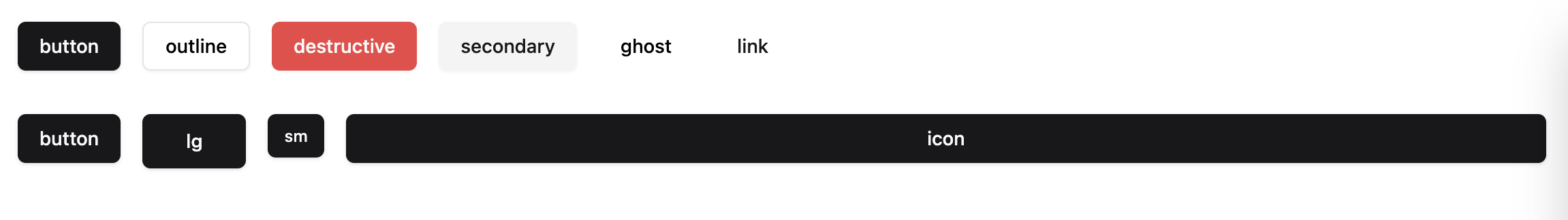
他のパターンも表示しています。
<div class="p-4 flex gap-4">
  <%= component(:button) {"button"} %>
  <%= component(:button, variant: :outline) {"outline"} %>
  <%= component(:button, variant: :destructive) {"destructive"} %>
  <%= component(:button, variant: :secondary) {"secondary"} %>
  <%= component(:button, variant: :ghost) {"ghost"} %>
  <%= component(:button, variant: :link) {"link"} %>
</div>
<div class="p-4 flex gap-4">
  <%= component(:button) {"button"} %>
  <%= component(:button, size: :lg) {"lg"} %>
  <%= component(:button, size: :sm) {"sm"} %>
  <%= component(:button, size: :icon) {"icon"} %>
</div>variant, styleの値によってスタイルが変更できていることが確認できます。
スタイルを上書きできるようにする
最後にshadcn/uiと同じようにクラスを追加してスタイルを上書きできるようにします。
tailwind_mergeというgemを追加します。
gem "tailwind_merge"bundle installクラスをマージする関数を定義します。
class ApplicationViewComponent < ViewComponentContrib::Base
  extend Dry::Initializer

  include ViewComponentContrib::StyleVariants

  ## 追加
  private

  def tw_merge(*inputs)
    TailwindMerge::Merger.new.merge(inputs.join(" "))
  end
end
この関数を使うことで"w-4 w-full"のようなバッティングするクラスがある場合に後の方(w-full)を優先するということができるようになります。
buttonコンポーネントにclass_nameという引数を追加、viewファイルでclass_nameを優先してマージするように修正します。
# frozen_string_literal: true

class Button::Component < ApplicationViewComponent
  option :variant, default: proc { :default }
  option :size, default: proc { :default }
  option :class_name, default: proc { "" } # 追加

  # 省略
end
<button class="<%= tw_merge(style(variant:, size:), class_name) %>">
  <%= content %>
</button>
クラスを追加してスタイルを上書きしてみます。
<div class="p-4 flex gap-4">
  <%= component(:button) {"button"} %>
  <%= component(:button, variant: :outline) {"outline"} %>
  <%= component(:button, variant: :destructive) {"destructive"} %>
  <%= component(:button, variant: :secondary) {"secondary"} %>
  <%= component(:button, variant: :ghost) {"ghost"} %>
  <%= component(:button, variant: :link) {"link"} %>
</div>
<div class="p-4 flex gap-4">
  <%= component(:button) {"button"} %>
  <%= component(:button, size: :lg) {"lg"} %>
  <%= component(:button, size: :sm) {"sm"} %>
  <%= component(:button, size: :icon, class_name: "w-full") {"icon"} %> <%# 変更 %>
</div>
ルートページにアクセスするとスタイルを上書きできていることが確認できます。
これでshadcn/uiのボタンコンポーネントをRailsのViewComponentを使って再現することができました。
参考
https://techracho.bpsinc.jp/hachi8833/2024_03_07/139774
https://github.com/palkan/view_component-contrib
https://github.com/shadcn-ui/ui
.png&w=256&q=75)


Shota Nagato
Webエンジニア
RailsとかNext.jsとか